Tena Koutou! 🇳🇿
Just a few days ago, the Big Science project pulled the curtain back on their latest creation, the Bloom language model 🌸. This grand unveiling was the culmination of a year-long dance between over 1000 researchers and 250 institutions, hailing from all corners of our world (70 countries, to be exact). Who's leading the charge, you ask? That would be the American startup Hugging Face 🤗 (interesting trivia - it's the brainchild of three French founders), joined by the heavyweights of high-performance scientific computing, including the Jean Zay supercomputer flexing a 28-petaflop muscle.
The mission? Democratize these models, often cloaked in secrecy by tech giants, and offer researchers a chance to dissect them — their limitations, environmental footprints, hidden biases, and ethical wrinkles. Plus, there's the added bonus of breaking the English language stranglehold.
Bloom has been trained on 46 different languages and 13 programming languages, with its structure and size (we're talking about 176 billion parameters here) placing it shoulder-to-shoulder with OpenAI's superstar, GPT-3. While we're all chomping at the bit for a beefed-up API, you can take Bloom for a spin in a compact demo already up and running.
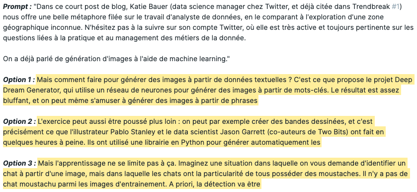
I gave it a whirl, feeding it the opening lines of the previous newsletter and let it rip (scroll down to see the top three suggestions that caught my eye).
So, what's the verdict? Buckle up because the results are quite the roller coaster ride! Yes, it nails the tone, but it also cooks up some plausible yet somewhat fictional details. Sure, there's a real Deep Dream Generator and an illustrator by the name of Pablo Stanley who's crafted an avatar generator with a developer pal. But Jason Garrett and an AI-created comic strip are pure figments of Bloom's imagination.
So, proceed with caution!

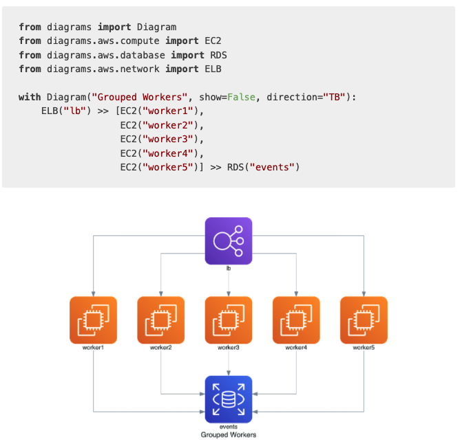
If you regularly tackle software architecture diagrams but Powerpoint and you aren't exactly best friends, I've got just the tool for you! Whip up the relationships between various objects in Python, and voila, you've got a snazzy PNG, SVG, or PDF diagram at your fingertips.
And for those of you already ahead of the curve, versioning the diagram-generating code is a neat trick to keep your documentation fresh as a daisy 🤓

Finally, we're capping things off with an oldie but goldie from Mike Bostock, the maestro behind d3js, an interactive visualization library that's truly a sight to behold. Mike, after stints in the New York Times' dataviz department, now wears the CTO hat at ObservableHQ. In his riveting blog post (it's long but oh so enlightening), he illustrates how animated, interactive visuals are a powerful tool to untangle the knots of algorithms. You see, a static graph can't capture their dynamism, you need to see them in action, much like observing the inner workings of a machine to really grasp how it ticks.
He brings this to life with a few time-tested programming examples — a sorting algorithm, maze creation, and an algorithm for image size reduction.

Dive in, enjoy, and catch you on the flip side! 😀