Teanastëllën 🇪🇹
➡️ Twitter 🐦 was abuzz last week with chatter from the scientific community 👩🔬👨🔬 over the release of Meta's (formerly Facebook) latest Large Language Model (LLM), Galactica 🌌. Hyped as the scientific equivalent of GPT-3, Galactica was introduced as a language model capable of generating fresh Wikipedia articles on any topic, having been trained on a vast array of 48 million documents, including articles, books, and encyclopedias.
However, the thrill was short-lived. Just three days post-unveiling, the demo was taken offline. Why? Because it turns out, language models like Galactica, for all their power, currently struggle to distinguish fact from fiction, a significant hurdle when the job is to summarize scientific knowledge... 🤔
Offering a public demo did have an upside. It let NLP researchers take Galactica for a quick spin and promptly highlight its limitations. The issue? Galactica could spew grammatically impeccable text mimicking the tone of scholarly articles, which might give a false impression of authority even when the content is flawed or biased. MIT Technology Review caught the essence of the issue in this article.
This incident triggers some thought-provoking questions about the future of scientific research 🧬🧪. The advancement of research depends on meticulous peer-reviewing and validation of proposed developments before they get published. This massive validation process, mostly shouldered by the scientific community for free, is often undervalued. The influx of auto-generating article tools could flood publication calls, deterring researchers, and potentially diminishing the quality of published research. For a more in-depth look at this issue, I recommend this analysis by Michael Black, a Research Director at the Max Planck Institute in Munich 🇩🇪.
➡️ Stacked area graphs may be easy on the eyes, readily available in Excel, and a common feature in many reports and infographics 📊. But their interpretation? That's a whole different story!
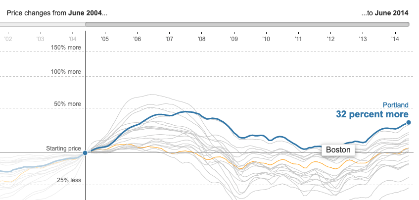
This blog post (a little dated, but still hitting home) offers a compelling argument against them, along with some reader-friendly alternatives. I, for one, am partial to interactive visualizations that allow you to highlight specific curves while dimming the rest, like the example below (source).

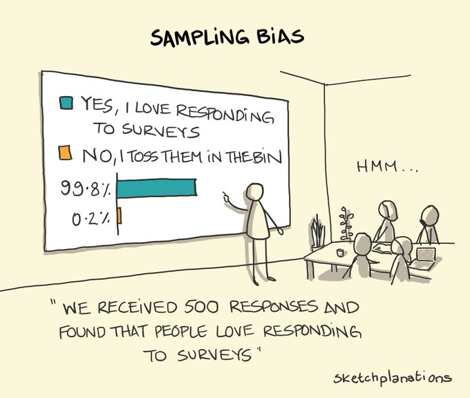
➡️ And to wrap things up, have you ever bumped into sampling bias? The illustration below is a fantastic explainer, demonstrating it with an extreme case. It's one of the many statistical biases that can trip you up when you try to draw broader conclusions from a limited subset of a population. If the subset is significantly different from the whole, your takeaways from it may not apply!
The sketch is the work of Jonathan Hey, the creative mind behind Sketchplanations, where he shares an enlightening sketch every week.

Enjoy the reads, and have an awesome week! 📚